
Photo by: Mathew Brady
Image Source: https://www.flickr.com/photos/usnationalarchives/4153089339/in/album-72157624163230215/
Year Created: Circa 1863
Use of Lines:
Mathew Brady uses lines in order to direct the viewers attention from one part, or third, of the image to another. The first line starts with the bridge going across the river, the second line is the column of cavalry leading from the bridge toward the road, being the third line, which leads to the man with his foot on the post at the bottom-right of the photograph. The two lines, one being the road and the other being the bridge, lead the viewers attention to the cavalry, which is the main subject matter for the photograph.
Keep it Simple:
Although there are a lot of people and horses cluttered in the photograph, Mathew Brady still kept the picture simple. The line of cavalry in the image are in a tight formation, so despite the large mass of people and horses, it does not have a cluttered feel to it. Also, the vast expanse of space within the entire photo helps to keep the attention of the viewers in various locations which helps take away from any possible cluttering in the photograph.
Depth of Field:
The main subject, that being the cavalry, is perfectly in focus, while the rest of the land is a bit blurred. Which is the desired effect Mathew Brady was looking to achieve. It helps show the journey that this cavalry unit was making and the scale of the operation taking place in the image. The photograph uses great depth of field, with the group in front, but the big hills in the background helping to direct attention to not only the cavalry but the great background as well.
Why did I choose this image?
I chose image because as soon as I saw it I was quickly taken aback by the sheer volume of people and horses being moved across a great distance, and the logistics that had to go into making this operation a reality. And the beautiful view in the background also helped add to already great view created by the large group of people and beast of burden that were making their way through not the easiest of terrain.

For this picture the subject is on the left side of the picture, which was the intention of the photographer, Robert Capa.The American corps. member is on the right side. The rule of thirds helps guide the viewer through the photograph, starting with the gruesome injury on the prisoner's face, and moving to the right to the medic treating him.
Use of Shadows:
Robert Capa used shadows in this picture to make sure that the viewer's attention was directed towards the prisoner of war first. The medic's face is hidden by shadows cast by his helmet and the sun being behind him.The prisoner of war's face was directly lit up by the sun in order to help reveal his injuries.
Black and White:
When this photo was taken, in July, 1943, black and white imagery was the only thing available at the time. The black and white helps hide the face of the American medic, which directs attention to the wounded prisoner of war. The lack of color means that there are no distractions to take away from the impact of the gruesome injury sustained by the prisoner.
Why did I choose this image?
I chose this image because of the immediate impact that the gruesome injury displayed has as it jumps out instantly at viewers. Often times when we think about our enemies in war we forget that they too are still people, despite the cause that is driving their war machine. The photograph is like a perfect analogy, when we hate another individual or group of people so much we forget that they too bleed just like the rest of us. This image helps bring back into perspective the atrocities of war and the fact that neither side escapes unscathed.
The subject has a very serious expression, which they were posing specifically for the camera. The subject made sure to really expose her eyes, as they are the main subject. The subject was also posing for the people around the Steve McCurry, as there was a crowd surrounding the subject and McCurry and due to the strict male-female interaction rules in the Middle East.
In or Out of Focus:
The focus of the image is set on the subject, which is soft. The background behind the subject is out of focus and rough. The differences in focus between the subject and what's behind her is to help guide the viewers attention to the subject. Also, the green background helps match her eyes.
Abstraction:
The photo is representational of the fact that the environment the girl is living in are not the cleanest, as she has dust on her face. The subject matter is discernible due to the religious clothing that the subject is wearing, and the thin layer of dust caked onto her face. The feelings created by this image are that of wanting to aid the girl due to her people having been caught up in a war and poverty.
Why did I choose this image?
I chose this image because it is one of the most iconic images of the 21st century. The girl's bright penetrating green eyes really help to dive deep into the soul of the people who view this image. The photograph helped bring volunteer aid to Afghanistan and the people of Afghanistan were very proud, due to the girl being poor yet showing great pride, enthusiasm, and self-belief.
Photo by: Robert Capa
Image Source: http://www.magnumphotos.com/C.aspx?VP3=SearchResult&ALID=2K7O3R14Y2E4&IT=ThumbImage01_VForm&CT=Album
Year Created: 1943
Rule of Thirds:
For this picture the subject is on the left side of the picture, which was the intention of the photographer, Robert Capa.The American corps. member is on the right side. The rule of thirds helps guide the viewer through the photograph, starting with the gruesome injury on the prisoner's face, and moving to the right to the medic treating him.
Use of Shadows:
Robert Capa used shadows in this picture to make sure that the viewer's attention was directed towards the prisoner of war first. The medic's face is hidden by shadows cast by his helmet and the sun being behind him.The prisoner of war's face was directly lit up by the sun in order to help reveal his injuries.
Black and White:
When this photo was taken, in July, 1943, black and white imagery was the only thing available at the time. The black and white helps hide the face of the American medic, which directs attention to the wounded prisoner of war. The lack of color means that there are no distractions to take away from the impact of the gruesome injury sustained by the prisoner.
Why did I choose this image?
I chose this image because of the immediate impact that the gruesome injury displayed has as it jumps out instantly at viewers. Often times when we think about our enemies in war we forget that they too are still people, despite the cause that is driving their war machine. The photograph is like a perfect analogy, when we hate another individual or group of people so much we forget that they too bleed just like the rest of us. This image helps bring back into perspective the atrocities of war and the fact that neither side escapes unscathed.
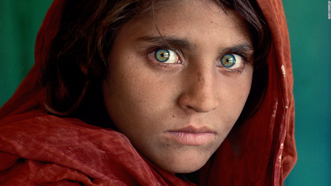
Photo by: Steve McCurry
Year Created: 1984
Subject's Expression:The subject has a very serious expression, which they were posing specifically for the camera. The subject made sure to really expose her eyes, as they are the main subject. The subject was also posing for the people around the Steve McCurry, as there was a crowd surrounding the subject and McCurry and due to the strict male-female interaction rules in the Middle East.
In or Out of Focus:
The focus of the image is set on the subject, which is soft. The background behind the subject is out of focus and rough. The differences in focus between the subject and what's behind her is to help guide the viewers attention to the subject. Also, the green background helps match her eyes.
Abstraction:
The photo is representational of the fact that the environment the girl is living in are not the cleanest, as she has dust on her face. The subject matter is discernible due to the religious clothing that the subject is wearing, and the thin layer of dust caked onto her face. The feelings created by this image are that of wanting to aid the girl due to her people having been caught up in a war and poverty.
Why did I choose this image?
I chose this image because it is one of the most iconic images of the 21st century. The girl's bright penetrating green eyes really help to dive deep into the soul of the people who view this image. The photograph helped bring volunteer aid to Afghanistan and the people of Afghanistan were very proud, due to the girl being poor yet showing great pride, enthusiasm, and self-belief.
No comments:
Post a Comment